
Cartier Roman and Italic – final unit values, Carl Dair, 1967
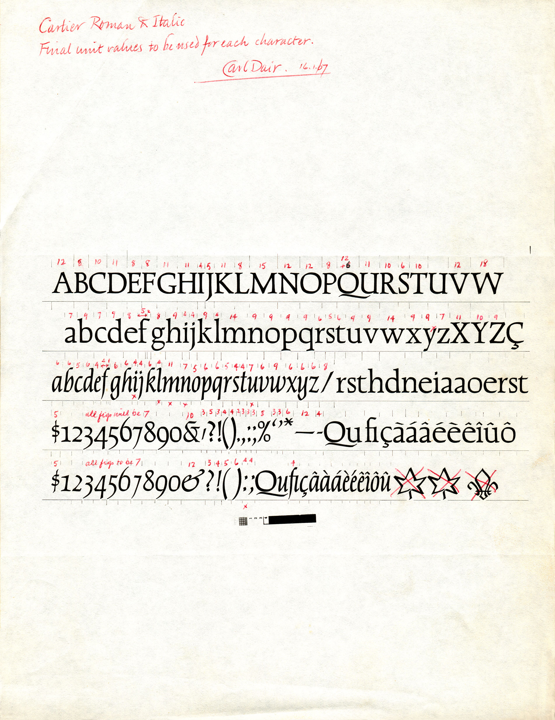
The Linofilm glass grids consisted of film negatives of the alphabet enclosed within a metal frame and were very similar to hot metal fonts. They were severely limited as to the number of characters they could hold, which is why Dair’s designs for the maple leaf and the fleur-de-lis ornaments are crossed out – there simply wasn’t enough room for them on the grid.
Notes
A photocopy of the character sets for Cartier Roman and Italic with the notations that Carl Dair made, in red pencil, for the final Linofilm unit values. The unit values are the widths assigned to each character in a font. That width includes both the character and the space on either side of the character. Some letters, such as the ‘W’ typically occupy the full width and in some cases even extend slightly beyond. Unit values are needed for the machines to calculate the number of characters per line. They also aid type designers in building internal continuity in a design. At the time, Mergenthaler Linotype, the manufacturer of the Linofilm, used an 18 unit grid (font). You can see that Dair assigned the widest measure, 18 units, to the ‘W’. Subsequent photo-typesetting machines would use a finer 54 unit grid which remained in use until PostScript. – Rod McDonald
*
This little piece of paper also has a special significance for the CTA. One summer day in 1984 as Rod McDonald was leaving work at Mono Lino, he walked by a row of large garbage bins and this letter caught his attention. A little surprised at finding such an important piece of information in the garbage, he quickly retrieved it along with a few other related items. He later donated all these items to The Carl Dair papers at the Robertson Davies Library, Massey College, University of Toronto. McDonald credits much of his lifelong interest in Canadian typographic history to his chance finding of this document.
-
Categories
Trade and Craft
Typeface DesignTitle
Cartier roman and italic final unit valuesDate
January 1, 1967Client
Mono Lino Typesetting Company LimitedCredits
Design: Carl Dair (1912–1967)Principal Typefaces
Cartier Roman and ItalicDescription
Handwritten character specifications
Size: 8.5 × 11 inchesRegion
OntarioLanguage
EnglishImages
1Holding
The Carl Dair Papers at the Robertson Davies Library, Massey College, University of Toronto -
Artifact copyright: CTA was unable to clarify rights but welcomes contact from rightsholders to resolve permissions, if required, and will remove digitized works at the rightsholder’s request (rightsholders may contact CTA at copyright@canadiantypography.ca). CTA makes digitized works available for education and research. Responsibility for any use rests with the user.
Notes copyright: Notes accompanying artifacts are licenced under Creative Commons licensing CCbyNC which allows for non-commercial use with attribute.
-
If you have any information about this work or those who contributed to it, or about any similar work that you would be willing to share, we invite you to contact us.
Please contact us at: info@canadiantypography.ca
⚠️ Do you have something to add? Did we get something wrong? Did we miss crediting someone? Please Submit an Edit to suggest a correction, or add to this artifact. Your contribution is important to us. Thank you in advance.