
Melure – the first display alphabet designed in Canada, Les Usherwood, 1964
Notes
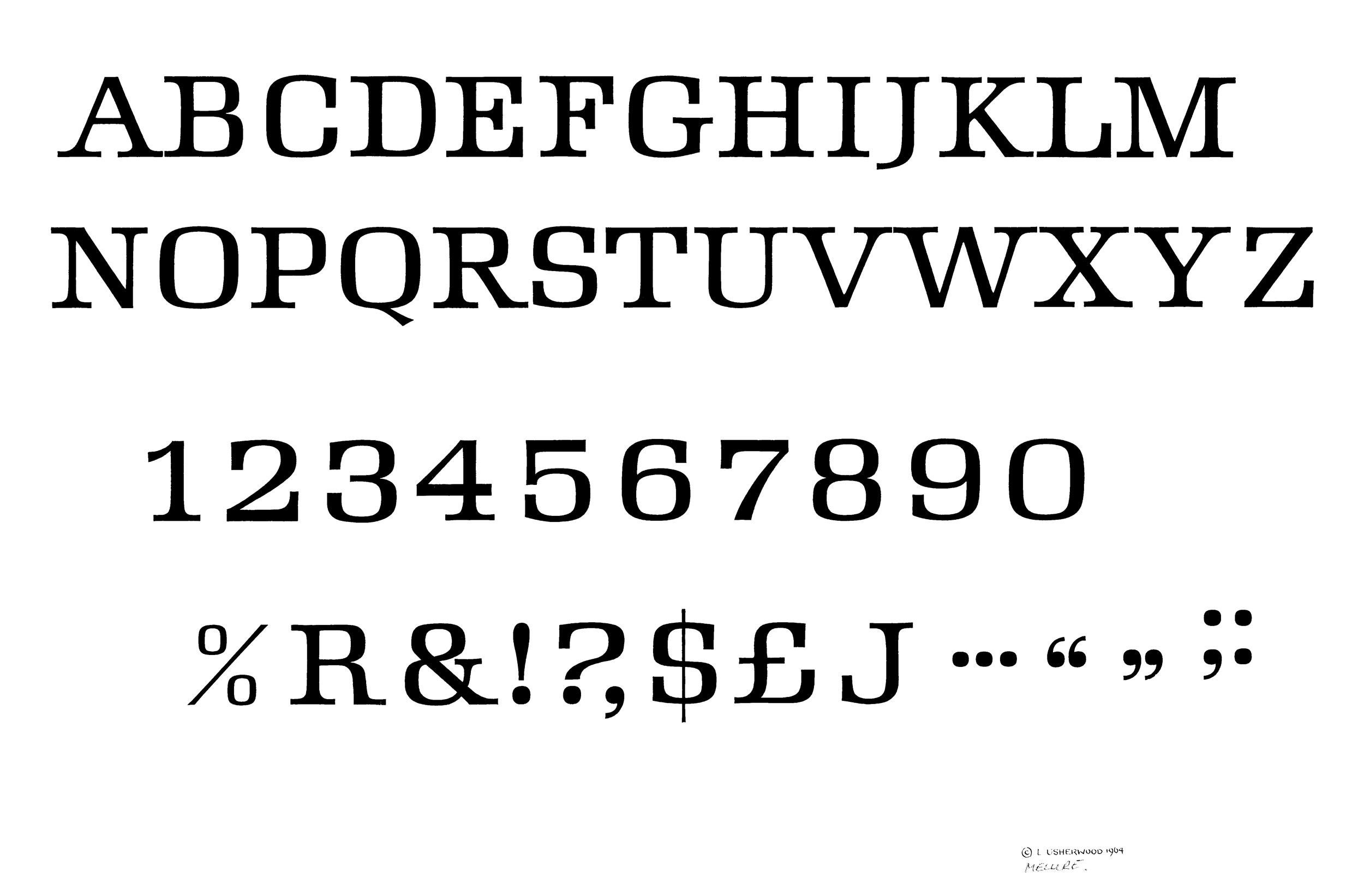
The first Latin alphabet to be designed in Canada is Melure created by the Toronto lettering artist Les Usherwood. Employed at Art and Design Studio (ADS), Usherwood spent over two years of his own time, working evenings and weekends, on the five-weight design before licensing it to Headliners International in New York for release in 1964. The italic weights may have been developed by Headliners using camera modification techniques.
Finding a good print of Melure was a bit of a challenge. Fortunately, Albert Macchiusi, one-time Typsettra employee had a print of the alphabet that he had found at Typsettra. That print is missing some characters and the lowercase, but otherwise is in excellent condition. It is also stamped and dated which is rare for these kinds of drawings.
Melure is based on Hermann Zapf’s Melior that had been released in 1952. The serifs are larger and the overall look is more casual than Melior. The mid stroke of the ‘S‘ is slightly below center in the ‘loose’ style of lettering popular at that time. The major difference between the two faces is that Melior is primarily a text face, while Melure is a hand lettered alphabet designed for headlines. Advertising headlines, or ‘heads’, were considered lettering – not type, and they were set by lettering artists – not typesetters. However, most lettering studios were owned by type shops and the two fields complemented each other. Cooper & Beatty, one of the big typesetters in Toronto, had the Canadian franchise for Headliners International, the headline company that released Melure.
After the release of Melure, Hermann Zapf, the designer of Melior filed a lawsuit against Headliners accusing them of plagiarism. Within the trade Melure would have been labelled a ‘similar to, but different’, design. Melure was sufficiently different from Melior that legally Zapf could not have won his case in court, especially in the United States. But from all accounts Zapf wasn’t particularly interested in money, he was upset about the promotional copy Headliners had written, specially the last line which said; “Ask for Melure. Melior is now old-fashioned.” It was a careless line that, to Zapf, seriously imputed his relatively new typeface. Zapf’s lawsuit was important in that it was one of the first signals that the type world was beginning to change and the old ‘that’s the way we’ve always done it’ attitude that had been so much a part of both lettering and type design was being questioned. It appears that Headliners quietly dropped Melure from their library, undoubtedly a result of the negative publicity from the lawsuit.
The unfortunate affair was certainly not what Usherwood would have wanted, or necessarily deserved, but he would have gained valuable insights into the lettering and type business. Four years later he and Dave Thomason, another lettering artist at ADS, would open Typsettra a Toronto type shop that would become the driving force in Canadian advertising typography. Typsettra would also go on to become the first company to design and market Canadian typefaces internationally. – Rod McDonald
-
Category
Typeface DesignTitle
Melure, the first Latin display alphabet designed in CanadaDate
1964Client
Les Usherwood and Headliners InternationalCredits
Design: Les UsherwoodPrincipal Typefaces
MelureDescription
A display face designed in the style of MeliorRegion
OntarioLanguages
EnglishNumber of images
1Holding
Private collection of Albert Macchiusi -
Artifact copyright: CTA was unable to clarify rights but welcomes contact from rightsholders to resolve permissions, if required, and will remove digitized works at the rightsholder’s request (rightsholders may contact CTA at copyright@canadiantypography.ca). CTA makes digitized works available for education and research. Responsibility for any use rests with the user.
Notes copyright: Notes accompanying artifacts are licenced under Creative Commons licensing CCbyNC which allows for non-commercial use with attribute.
If you have any information about this work or those who contributed to it, or about any similar work that you would be willing to share, we invite you to contact us.
Please contact us at: info@canadiantypography.ca
⚠️ Do you have something to add? Did we get something wrong? Did we miss crediting someone? Please Submit an Edit to suggest a correction, or add to this artifact. Your contribution is important to us. Thank you in advance.