
Canned Typography – poster, Cooper & Beatty, Jim Donoahue, 1971

Notes
We believe this to be the second in what became known as the Collection Series – a set of posters designed by Cooper & Beatty creative director Jim Donoahue. The concept was straightforward: gather examples of type and lettering from non-typographic sources, such as old three-dimensional sign letters, matchbook covers, or antique tin cans. These elements were then arranged in an engaging composition, professionally photographed, and printed.
Donoahue understood that other designers would find these letterforms just as compelling as typefaces – and he was right. The posters quickly became highly sought after and were avidly collected. Notably, Donoahue maintained a subtle approach to branding, keeping the Cooper & Beatty name in the background – an understated strategy he likely learned from Allan Fleming. – Rod McDonald
The Morgan Press collection of wood types can be seen at: https://www.peculiarmanicule.com/morgan-press-wood-type-catalog
Artifact Text:
CANNED TYPOGRAPHY
Our thanks to John Sebert for the cans, Ray Webber for the photograph and Herzig Sommerville for the colour separations.
Cooper & Beatty, Limited
-
Category
Advertising and PromotionTitle
Canned TypographyDate
1971Client
Cooper & Beatty, LimitedCredits
Design: Jim Donahue (1934–2022)
Typography: Cooper & Beatty, LimitedPrincipal Typefaces
Display: Headliners Morgan Press library; MP387
Text: Helvetica, Helvetica BoldDescription
Four-colour poster
Size: 18 × 24 inchesRegion
OntarioLanguages
EnglishNumber of images
1Holding
Private collection of Albert Macchiusi -
Artifact copyright: CTA was unable to clarify rights but welcomes contact from rightsholders to resolve permissions, if required, and will remove digitized works at the rightsholder’s request (rightsholders may contact CTA at copyright@canadiantypography.ca). CTA makes digitized works available for education and research. Responsibility for any use rests with the user.
Notes copyright: Notes accompanying artifacts are licenced under Creative Commons licensing CCbyNC which allows for non-commercial use with attribute.
-
More of the Morgan Press collection of wood types can be seen at:
https://www.peculiarmanicule.com/morgan-press-wood-type-catalog
You might also like:

Men of Letters poster – Cooper & Beatty, Jim Donoahue, 1969

Spacing Chart – Cooper & Beatty, 1927
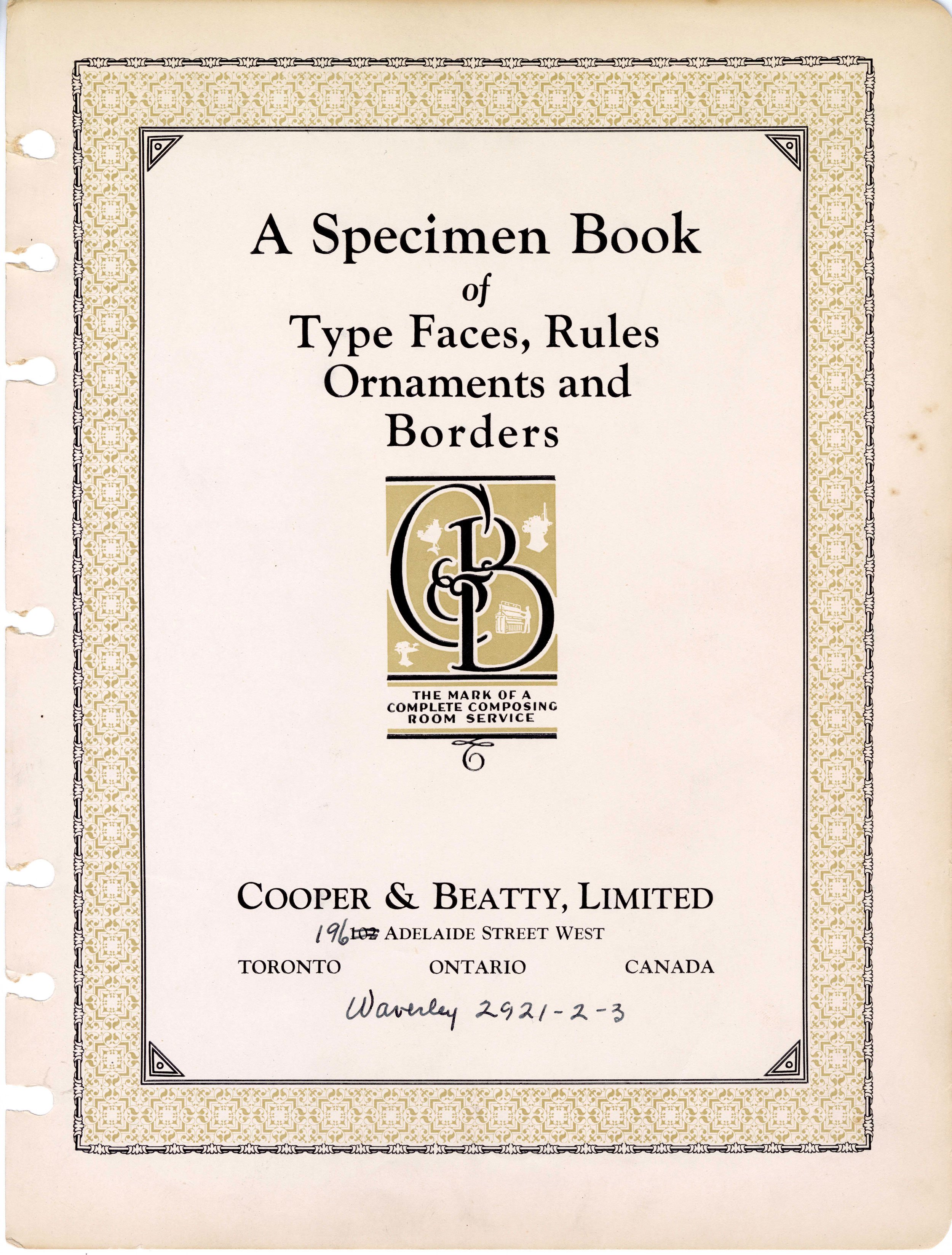
Type Book - A Specimen Book of Type Faces, Rules, Ornaments and Borders – Cooper & Beatty, 1927
If you have any information about this work or those who contributed to it, or about any similar work that you would be willing to share, we invite you to contact us.
Please contact us at: info@canadiantypography.ca
⚠️ Do you have something to add? Did we get something wrong? Did we miss crediting someone? Please Submit an Edit to suggest a correction, or add to this artifact. Your contribution is important to us. Thank you in advance.